

Duquesne Incline Website Redesign
OVERVIEW
The Duquesne Incline acknowledged that their users faced difficulties navigating their website and were unable to find the desired information.
To address this issue, I conducted user research to identify the specific problems encountered by users. Based on my findings, I developed a new user-friendly website using HTML, CSS, and Javascript.
ROLE
UX Researcher
Prototyping & Testing
Web Developer
Web Designer
DURATION
2 weeks
The Challenge


COLOR SCHEME
The website lacks consistency in its use of colors, resulting in a different color being applied to almost every element. This inconsistency makes it challenging to read and navigate through the website effectively.
TEXT
The text on the website also suffers from inconsistent colors and fonts. Some important text is presented in lighter shades, which increases the likelihood of users overlooking it. Additionally, certain sections contain large blocks of text that are not easily scannable. Furthermore, there is a lack of hierarchy in organizing the information on each page.
IMAGES
While the Duquesne Incline possesses stunning videos showcasing Pittsburgh, the images used on the website are of poor quality and fail to accurately represent the incline's beauty.
REPETITION
Multiple sections of text are needlessly repeated throughout the website. Despite the presence of a menu for different pages, most pages contain redundant or similar information.
Reconstructing the Information
Hierarchy
Users found the website structure unclear, with multiple pages lacking visual cues for finding specific information. To tackle this issue, I developed an information architecture map to improve the organization of content. The Duquesne Incline requested to keep the current menu items during the website restructuring.


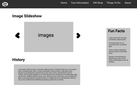
Initial Wireframe Designs
Utilizing the Information Architecture Map as a guide, I proceeded with the wireframing phase to gain a comprehensive understanding of the optimal placement of these items on the interface, as well as to determine the interactions between various screens.
Transition to Figma Prototyping
Subsequently, I made the decision to transform the wireframe into a low-fidelity prototype using Figma.


Testing Prototypes with Users
To assess the effectiveness of the new website design, I conducted two think-aloud protocols, which allowed me to observe users' navigation and usage patterns. The participants were assigned three tasks specifically chosen to address the challenges that current users faced on the existing website. The three tasks asked were:
-
Sign up to join the Duquesne mailing list.
-
Plan a trip to the Duquesne Incline. How much will it cost? When would you go?
-
Find out who designed and created the Duquesne Incline.
The aim was to observe how participants reacted and approached these tasks, thereby determining if the user problem had been successfully addressed in the new website design.
Some design changes included:
-
Adding a new page to allow users to buy a ticket online
-
Creating a confirmation page after joining the mailing list to avoid confusion
-
The user experience under the activities could be enhanced
Solution
I redesigned the Duquesne Incline using HTML, CSS, and Javascript, with a primary focus on improving user-friendliness and enhancing the discoverability of information. Furthermore, I incorporated additional functionalities, including an online ticket purchasing page and a direct contact option to facilitate communication with the Duquesne Incline. Below is a brief overview of the proposed new website design.